
👋 Hi, I'm Brad Warfield
Data Analyst | Business Analyst | Education Analyst | Sports Analyst
🧑🏫 Math Teacher turned Data Analyst
💻 Excel, Tableau, SQL
🌄 Hiking, Reading, Athletics, Role Playing Games
📍 Mars Hill, NC, USA
Technical Skills

Excel
Tableau
SQL
Power BI
Snowflake
MySQL
Project Management
Research
Statistics
Dashboards
Storytelling
Documentation
Data visualization
Data analysis
Projects
🏥 Analyzing Hospital Data with SQL
SQL| Exploratory Data Analysis
◾ Analyzed what affections hospital stay length in MySQL
◾ Created a histogram using SQL (weird, I know)
◾ Real data from over 101,000 hospital patients
.
🏡Residential Real Estate in the United Kingdom
Excel | SQL | Tableau
Descriptive Data Analysis | Data Visualization◾ Built an analysis ready real estate data set by linking properties to sale records, cleaning messy data, and calculating needed information.
◾ Used multiple tools without direction to respond to prompts.
◾ Created reliable summaries of real estate sale prices using multiple variables and median based metrics.
◾ Presented findings through clear visuals and short written takeaways designed for quick decision making.
.

💲 Financial Support for Zimbabwe
SQL | Exploratory Data Analysis
◾ Data-mined 1.2M real bank transactions to find financial outliers, patterns, & trends
◾ Used a subquery as a strategy for more precise filtering
◾ Used SQL clauses such as SUBSTRING, WHERE, LOWER, GROUP BY, AVG, MIN/MAX, SUM, AND, etc
◾ Created written report highlighting findings
.

🍔 Come and Knock on Our Door: iFood Marketing Project in Excel
Excel | Exploratory Data Analysis | Data Visualization
◾ Real world-marketing campaign data
◾ Using only Excel for analysis and data visualization
◾ Utilized VLOOKUPS, Pivot Tables, Scatter Plots, & Bar Charts
◾ Provided a comprehensive write up to help the marketing team on their next campaign
.

🏫 Class Size and College Attendance Project with Tableau
Tableau | Data Visualization | Data Research
◾ Created dashboard evaluating 1,800 different schools' performance across 100's of features
◾ Used Scatter Plots, KPI's, Bar Plots, & box plots to answer question and dive deeper to show more impactful metrics
◾Added extra public data and cleaned in Excel
.

🎓 Help Me Help You: Student Habits Project with Excel
Excel | Exploratory Data Analysis | Data Visualization
◾ Explored data set with about 2000 rows and 16 columns
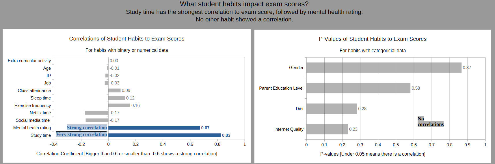
◾ Analyzed for correlations with quantitative and qualitative data
◾ Created bar graphs and written report highlighting findings
.
🛸 The Tourists Are Out There: Analyzing Alien Visit Data for Explore Asheville using Excel
Excel | Desmos | Data Visualization
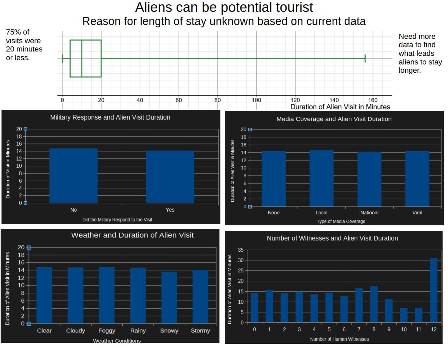
◾ Analyzed fictitious data on alien visitations
◾ Used analysis to find answers to actual local economic problem
◾ Built a data visualization and created a written report
.
About Me

👋 Hi, I'm Brad & welcome to my portfolio! I have been obsessed with statistics and analysis as long as I can remember. As a teacher, I would analyze data daily to inform decisions. This time became one of my favorite parts of the day. I started to wonder how much better analysis could I do with more time.I'm proficient in analyzing data with:
- Excel
- Tableau
- SQL
- Power BII am learning more and practicing every day.And I'm looking to help a company solve problems with my curiosity-driven analysis. If you'd like to contact me, feel free to contact me.
Email:
[email protected]
LinkedIn: https://www.linkedin.com/in/brad-warfield/
Previous Experience
Data Analyst
Snow Data Science · Remote · Jan 2026 - Mar 2026
◾Built an analysis ready dataset by linking 22,258 properties to 51,276 sale records
◾Created reliable trend summaries of price change over time by area and property type using median based metrics
◾Compared pricing patterns across key segments, including tenure type, by calculating differences within the same fieldMath Teacher
Asheville Middle School · Asheville, NC · Aug 2024 - Jun 2025
◾ Collected data with assessments. Organized, cleaned, and analyzed data with Excel
◾ Communicated analysis to coteacher and supervisor to collaborate in data-driven decisions
◾ Led colleagues and an instructional coach in use of Canvas software for student assessment data analysis and facilitation of transition to standards-based grading system
◾Documented student growth and communicated with stakeholders
◾Communicated with staff and students to serve as a liaison between users and tech supportMath Teacher
North Carolina Cyber Academy · Remote · Aug 2021 - Jun 2024
◾ Led change management of asynchronous to synchronous focused teaching for 8th grade math
◾ Wrote curriculum map for all 8th grade math classes during summer 2022 and 2023Math Teacher
North Carolina Virtual Academy · Remote · Aug 2019 - Jul 2021
◾ Led professional development on using formulas, vlookup, and pivot tables in Excel
◾ Nominated for Teacher of the Year in 2021Math Teacher
Brevard High School · Brevard, NC · Aug 2016 - Jun 2019
◾ Led math department of six in professional development on education software
◾ Initiated and led process to start AP Computer Science Principles class
Freelance work
Thanks for your interest in hiring me for a freelance job.I am currently not accepting new jobs. I will be available again starting Monday, August 9, 2026.If you would like to send me a preview of a job, you are welcome to email [email protected].
🏥 How Hospital Data Can Help Us Understand Patient Care
When a patient with diabetes checks into a hospital, then most often stay for a couple of days. But does the type of care they get, or even their background, change how long they stay or how many procedures they receive? I set out to answer questions like these using real hospital data, hoping to find patterns that could help healthcare workers and hospital leaders make better decisions.
Why I Chose This Project
Healthcare is personal. My children have needed emergency care, and my mom faced a cancer diagnosis at a young age. I’ve seen firsthand how important it is for hospitals to work well for everyone in the community. Where I live in western North Carolina, the main trauma center is under special oversight because of serious safety concerns.I chose this project using healthcare data to demonstrate that I have the skills and understanding to both add value to a healthcare company and add to the well-being of a community.
What You'll Learn
🏥 How long do patients usually stay in the hospital?
Most diabetes patients stayed 7 days or less. The most common lengths of stay were just 2 or 3 days. This is important because hospital leaders often want to keep stays short, both for patient well-being and for managing costs.
🏥 Do emergency stays look different?
Patients admitted for emergencies had even shorter stays—about 2.5 days on average, compared to the overall average of 4.4 days.
🏥 Are some specialties doing more procedures per encounter?
Yes. Thoracic surgery had the highest average number of procedures per encounter (about 3.5). Radiology and cardiology also had high averages and more total procedures because they handled more patients.
🏥 Are patients of different races treated differently in terms of lab procedures?
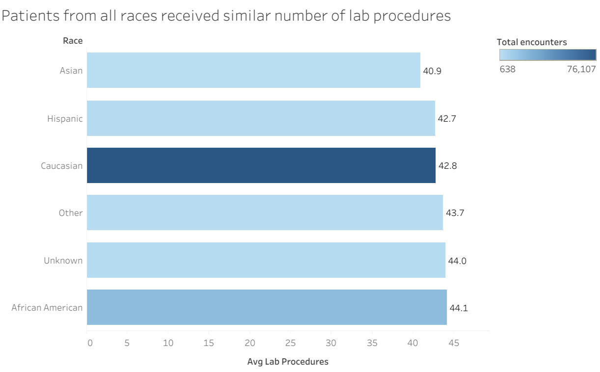
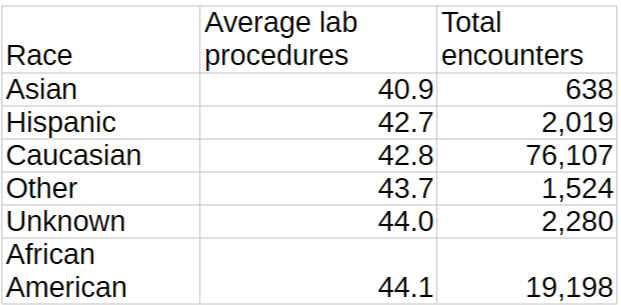
On average, patients from different races received a similar number of lab procedures per encounter. The average ranged from about 40.9 for Asian patients to 44.1 for African American patients. This suggests there may not be major differences by race at least for this measure, but I recommend looking at other variables and possibly doing a qualitative survey to be sure.
🏥 Does having more procedures mean a longer hospital stay?
There was some evidence of a possible positive trend: when more procedures were done, hospital stays tended to be longer. However, I suggest running a regression analysis to check if this relationship is statistically meaningful.
🏥 What about medication use?
Insulin was the most common medication across all age groups. For encounters with the most medications, 80% of patients received between 64 and 69 different meds.
Why This Matters
These patterns can help hospital staff and leaders see what’s typical and spot where things might need a closer look. For example, knowing that most patients stay just a few days could help with planning and resource allocation. Seeing that lab procedures don’t vary much by race is a good sign, but it’s worth checking other aspects of care to make sure there are no hidden disparities.
The Data and Tools I Used
For this project, I used a large dataset from the UCI Machine Learning Repository. It covers 10 years of hospital stays for diabetes patients across 130 hospitals in the United States. The main table includes over 100,000 records of individual hospital encounters, with details like length of stay, procedures, medications, and patient demographics. Another table has demographic information for over 70,000 patients. There are some missing values, which is common in real-world healthcare data.
To analyze the data, I used SQL for querying and summarizing, Tableau and Power BI for visualizations, Excel for some calculations, and Desmos Graphing Calculator to explore data and confirm findings.For more details on how the data was obtain, see Impact of HbA1c Measurement on Hospital Readmission Rates: Analysis of 70,000 Clinical Database Patient Records
Audience
With any data analysis project, it is important to know who the audience of the final report will be. I had hypothetical hospital administrators and colleagues in mind as I worked on these analyses. I wrote the insights with them as the audience
Since this is a part of my portfolio, there will also be explanations for potential employers or anyone who would like to know more about some of my analytical thought processes. Please message email [email protected] or message on LinkedIn if you would like to know more about my analytical thought processes.
Problems Solved
Problem #1
Senior Healthcare Analyst Florence Nightingale wants to know:
👩⚕️ What is the distribution of time spent in the hospital?
👩⚕️ Do most patients stay less than seven (7) days?
Insights
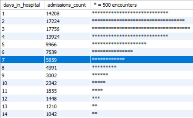
Most patient stays are less than 7 days.
The most common lengths of stay are 2 and 3 days.
Patients who stayed less than 7 days had lower readmission rates
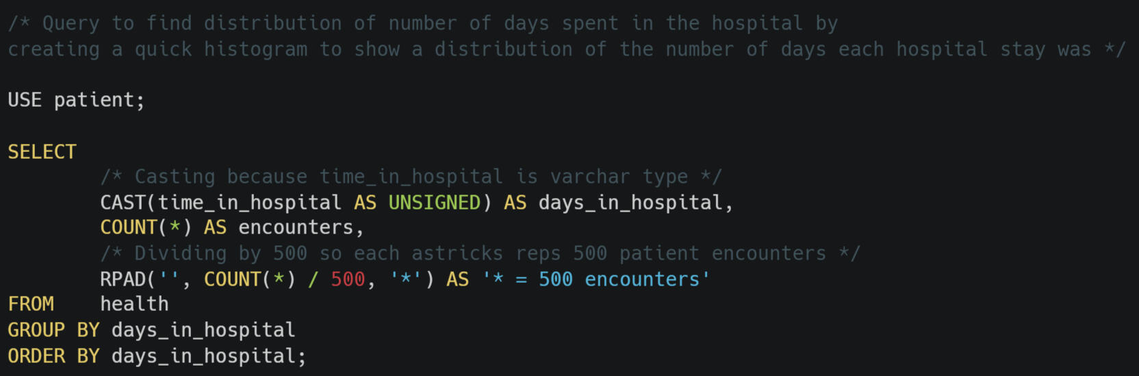
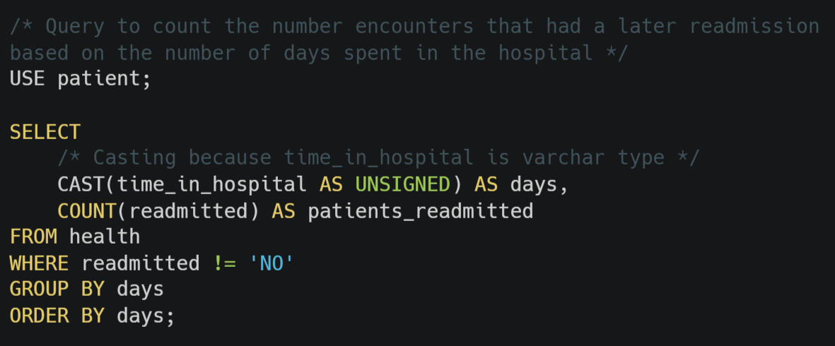
Sr. Analyst Nightingale,The distribution of time spent in the hospital shows that most patients spend less 7 days in the hospital. The most common encounter lengths are 2 to 3 days.Good news, the patients staying less than 7 days have a lower readmission rate than the ones staying 7 days of more. This may be a sign that patients are not being rushed out to save money.Keep reading to discover how I came to these conclusions or click to go to the next problem.Histograms are a good way to show a distribution. Normally, I would use Tableau, Excel, or Desmos to create a histogram. What if someone wanted a distribution of a large data fast?SQL can be used to create a histogram. First, I needed the length of time spent in the hospital as a number. The column time_in_hospital was a varchar type, that is text only. So I used CAST to temporarily convert it to a type that can be sorted in numerical order.Next, I coded to count the total number of stays for each day. Finally, I had MySQL output an asterisk, *, for every 500 stays for each day. I clicked on the output at 7 since the stakeholder wanted to know if most stays were fewer than 7 days.This histogram doesn't have anything fancy. Yet it communicates clearly that most stays were fewer than 7 days and it was made rapidly.After I had created the histogram, I wanted to check to see if patients were not being discharged early. Goodhart's Law says that when a metric is used as a goal, then the metric is not as good of a measurement. What if patients were being discharged early to reach a goal of encounters being less than 7 days?The only data that might help with this is patient readmission. I wrote another SQL query to count how many of the encounters for each number of days in the hospital were later readmitted. I used Excel to calculate the percent of encounters that had a later readmission.Patients who stayed less than 7 days had a readmission rate of 45%. Patients who stayed 7 days or more were readmitted 49% of the time.Note: it is important to know what information is and is not in a dataset. One of the 5 criteria to be included in this dataset was the hospital stay had to be, "at least 1 day and at most 14 days" (Diabetes 130-US Hospitals for Years 1999-2008). It might be that there were more stays over 7 days if the encounters longer than 14 days were included.The images below show the SQL code I wrote for this problem. You can download my first query for the histogram here. and the second query to count the readmissions here.
You can also download a CSV of the first SQL output seen in the table above. The CSV for the second query can be found here. Click here for the Excel file calculating readmission percentages.Fun fact: Florence Nightingale invited the polar area diagram, which is a type of histogram. She she used statistics, data analytics, and data visualizations. She is considered by many to the the founder of professional nursing.
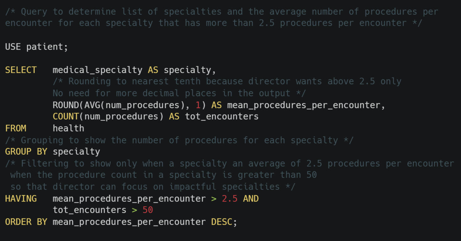
Problem #2Sherman Potter, a new Hospital Director, wants to understand which medical specialties tend to have more procedures per hospital encounter.⛺ He has asked for a list of specialties and with an average of more than 2.5 procedures per encounter.
Insights
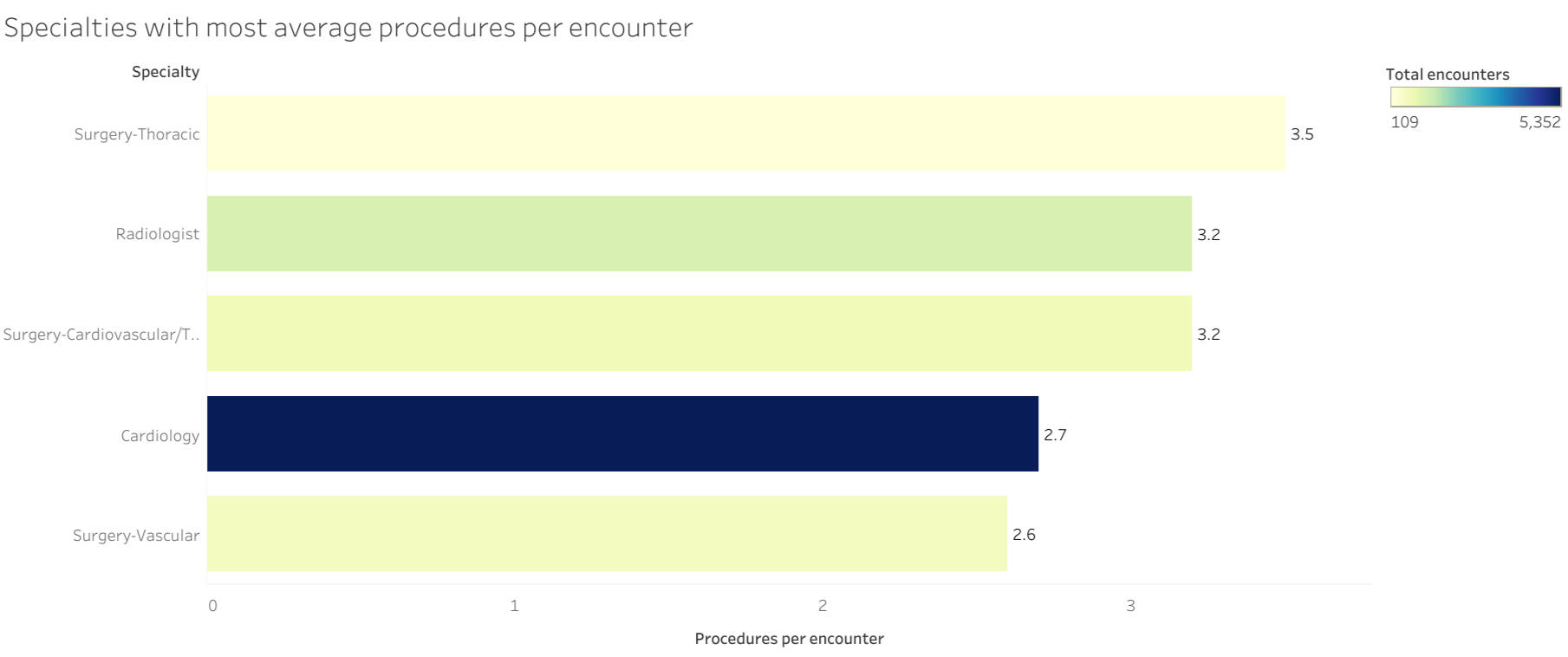
Radiology and cardiology both had over 1,000 total procedures and a high average of about 3 procedures per encounter.
Thoracic surgery had the highest average number of procedures per encounter, but the fewest total procedures on this list.
The new director wants to know which specialties have more than 2.5 procedures per encounter. Coming right up Col. Potter.I decided to use mean to calculate the average and not median. Median would mostly give whole numbers. Seeking specialties with greater than 2.5 average procedures implies that I needed precision to the tenths place. I kept in mind to look out for outliers using mean.I wrote SQL query and got a list of all of the specialties listed from highest to lowest mean procedures per encounter. The top specialty was proctology with 4 procedures per encounter. There was only one encounter with proctology. While I have sympathy for the patient that had 4 procedures, 53 labs, and 11 medications with a proctologist (ouch!), I suspect the new director is not as interested in that one patient encounter.I added to my HAVING clause so that I filtered for only specialties that had more than 50 encounters. This new query returned 5 specialties. Look below for the exact SQL code I wrote.I ran queries to check the distribution for each of the five specialties. They all had a range of 0 - 6. With no outliers or skewed distributions, mean remains a good choice for the average.I exported a CSV from MySQL and imported it into Tableau. I created a bar graph for the new director. I sorted so that the greatest mean procedures per encounters was on top. I also added a color scale based on the total number of encounters. In the tool tips, I included the total number of encounters and the total number of procedures for each specialty. You can find these by clicking here.The new director did not tell me why they want this information. Perhaps they want to start with making sure cardiology has the resources they need because they have by far the most procedures. Maybe they are wanting to start with thoracic surgery to work on reducing the average number of procedures per encounter.One thing I learned in this project was to use HAVING instead of WHERE when filtering aggregated data in SQL. I love learning new things!The image below show the SQL code I wrote for this problem. You can download my code here..
You can also download a CSV of the SQL output.Fun fact: Col. Sherman Potter is a character from the show MASH. He was the leader of the 4077th and joined in the 4th season. This seemed like the perfect name for a new hospital director.
Problem #3Suana Dragand, the Chief of Nursing, wants to know if the hospital seems to be treating patients of different races differently, specifically with the number of lab procedures done.
Insights
All racial categories that were tracked had a similar number of lab procedures on average.
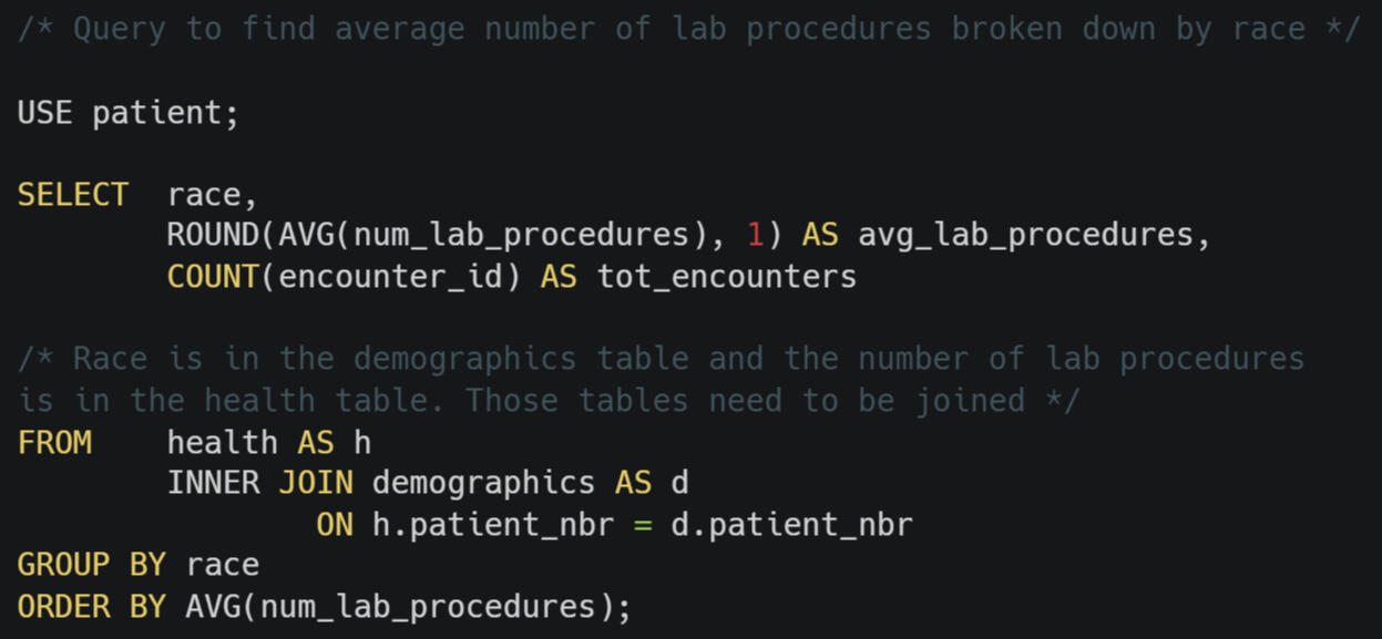
Great question, Chief Dragand. I will be right back with those numbers on labs and race.Data on the race of patients and the number of lab procedures done for them were located in different tables. This meant I needed to use JOIN to combine the tables.Both tables have a field called patient_nbr. This is an ID number that helps keep track of the data for each patient and detaches their data from anything that could identify them. Using ID numbers for patients allows this data to be public without violating the HIPAA rights of the patients.By using inner join, I told MySQL to find where the patient numbers matched. In this case, it did not matter which type of join I used. I used inner join because all data in both tables should be tied to a patient. If there was a situation where a patient had an encounter and their demographics was not recorded, then I would not want their data in this query. Even though it didn't matter this time, I chose inner join to make the query simpler to run again in case there are future errors introduced into the table.My query showed that the number of lab procedures each recorded race were similar. The range was about 41 to 44 labs.Since this Chief of Nursing is hypothetical, I was not able to ask them in what form that wanted a report. I asked several nurses what they prefer. Most said they are used to getting charts with numbers only. So I created a table and a bar graph.Of course, just the races recorded have similar numbers of lab procedures, that does not mean that there is no racial discriminator or systemic racism at these hospitals. This dataset does not have any information for a patient perspective. I recommend a patient survey that can show if patients feel they are being treated differently.The image below show the SQL code I wrote for this problem. You can download my code here..
You can also download a CSV of the SQL output.Fun fact: Suana Dragand is the head of the Yellow Ajah, a group of healers in Robert Jordan's Wheel of Time series.
Problem #4My boss, Goldmoon, asked me to explore whether hospital encounters with more lab procedures also tend to have longer hospital stays.
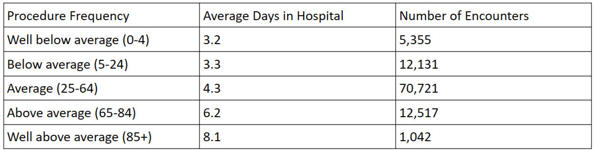
Insights
The number of lab procedures done can indicate how long a patient encounter lasts in the hospital.
I recommend a regression analysis to better determine if there is a correlation.
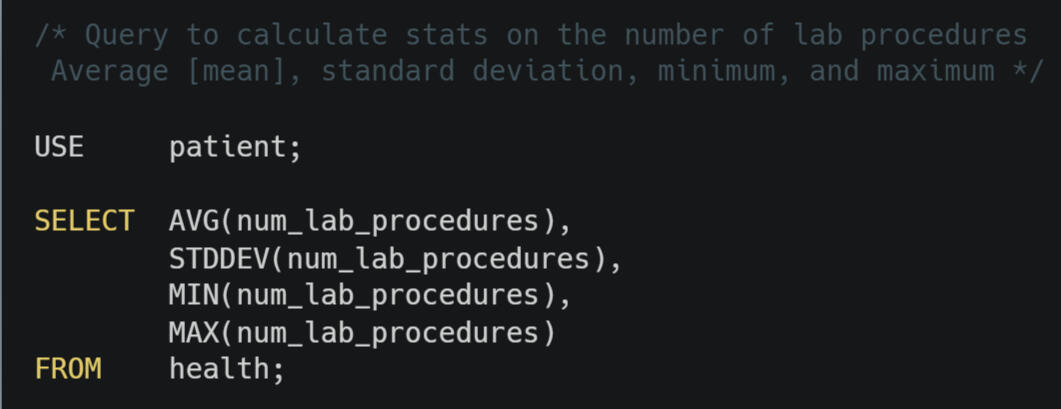
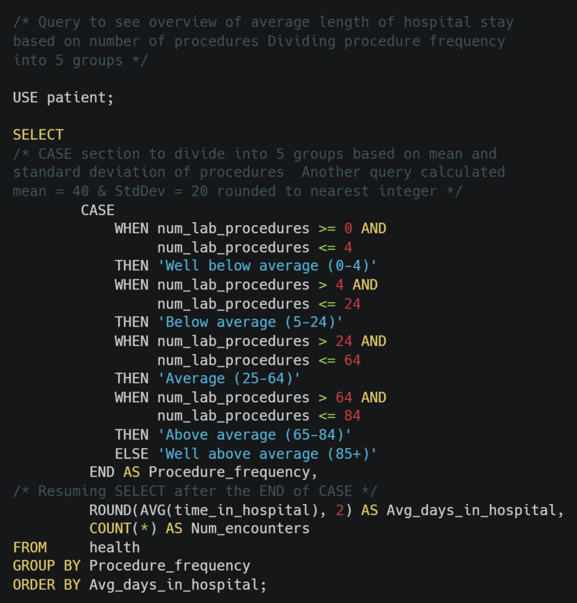
I can explore that for you, Boss Goldmoon. May I ask a question before I begin? You are right, I just did ask one. May I ask a clarifying question in addition to this question and my previous one?How specific do you want me to be with this exploration? You don't need a lot of details. How about if I see how long the typical stay is for patients with average, below average, and above average number of labs? Cool and when would you like this report? 30 minutes. I shall do my best!I went straight to my computer and opened MySQL. I wrote a quick query to calculate the mean, the standard deviation, the minimum, and the maximum for the number of procedures. I noticed there was a good bit of range beyond average + standard deviation. That led me to create five [5] categories, even though I asked the boss about three [3].Next, I wrote another SQL query to calculate the average length of stay for each procedure frequency category. I did this using the CASE WHEN structure. CASE WHEN is similar to IF conditional statements that can be used in Excel, Python, R, C#, and many coding languages.I added a third column to the query to display the number of encounters that were in each category. This ensures that the days in hospital averages are not greatly impacted by small samples. This also shows the sample is skewed to the right, meaning there are many more encounters with well below average number of procedures and well above average.This table seemed to show a pattern that patient encounters with more procedures tended to have longer stays in the hospital.I wanted to make a scatter plot and run a regression to check for a trend. I have taught scatter plots to middle and high school students. However, it was almost time to give the boss their report. I am sure they won't mind getting it 5 minutes early.I emailed the table to them with the insights seen above. I told them I am available to explain more if they want. I told them I have some time after lunch to investigate this potential trend.The two images below show the SQL code I wrote for this problem. You can download the code to calculated stats seen in the first image here. You can download the code to see if encounters with more lab procedures tend to have longer stays seen in the second image here.For a CSV of the output for each query, click here for the first and click here for the second.Fun fact: Goldmoon is a character who is a healing cleric in the Dragaonlance Chronicles trilogy by Margaret Weis and Tracy Hickman.
Problem #5
You just got an email from, Dr. Grace. a co-worker in Research. He wants to do a medical test with patients who meet either of these conditions:⚫ Their race is listed as African American.
⚫ Their metformin value is marked as 'Up' in at least one hospital encounter.He need a clean list of patient IDs as fast as possible. What do you do?
Insights
17,375 patients are African American or had their metformin increased
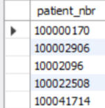
One clean list coming right up. Would you like that as a CSV or another format? Research does amazing work. I am glad to be able to help out.My Dr. Grace asked about information that is on two different tables. This seems like a situation where I need to JOIN the tables. I could do that. My co-worker just needs one clean list of patient numbers. Both tables have a column titled "patient_nbr." I can combine these tables using UNION.I chose UNION instead of UNION ALL because UNION by itself will filter out duplicates. This will give my co-worker in research their clean list.This was my first time using UNION in a query. I wanted to double check my work before sending it to research. I do not want them to do work on incorrect data. So, I wrote a second query using INNER JOIN. I got the same results!Yay! I love learning new commands and confirming accuracy.Note: The image of the table above is a partial list. I suspect nobody reading this projects wants to see 17,375 patient numbers. If you do, feel free to download the CSV here.The two images below show the SQL code I wrote for this problem. You can download the first code with a UNION here. You can download the first code with a JOIN here.Fun fact: Dr. Grace is a teacher and molecular biologist in the book Project Hail Mary by Andy Weir.
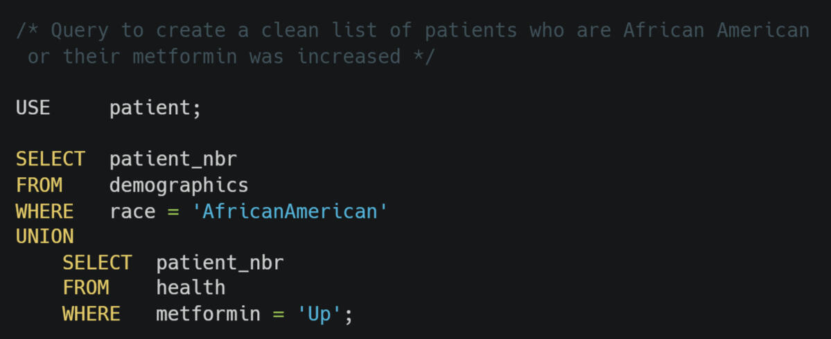
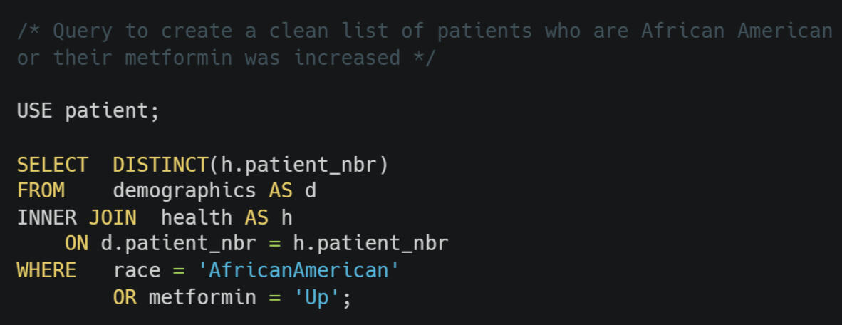
Problem #6
Radar, the Hospital Administrator wants to review emergency encounters where the hospital stay was shorter than the overall average.
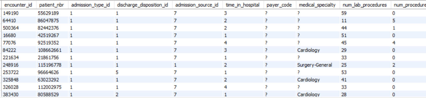
Insights
33,684 emergency encounters were shorter than the mean time for all hospital stays
The average length of stay for all hospital encounters in this dataset was greater than 4 days
Dear Hospital Administrator Radar,Thanks for entrusting me with the task of gathering this information for you. What information would you like about about these shorter emergency encounters? Do you want me to do analysis on these encounters? Is there any specific information about these shorter encounters?The administrator replied they wanted all of the information available in raw form so they could brainstorm over it.The health table has a column titled admission_type_id. The data dictionary did not have documented which id number represented emergency admissions. I asked the database administrator. She informed me that 1 is for emergencies.To compile all of the emergency encounters that were shorter than the average hospital stay, I could have calculated the mean hospital stay length and then filtered by less than that number. What if the administrator wanted this information updated in the future?I wanted to write a query that I could run again in the future that would automatically filter on the newest average hospital stay. That presented a challenge as the WHERE clause in SQL cannot filter by an aggregate, such as average. I overcame this challenge by using CTE, Common Table Expression.I was personally curious what the mean length of stay in the hospital was for all encounters. Thankfully, MySQL Workbench will sort a table when the column heading is clicked. I did this and saw that 4 days was the greatest time in hospital in the results table. This means the average must be greater than 4 days, probably 5 days.Note: The image of the table above is a partial list. I suspect nobody reading this projects wants to see 33,684 rows of data. If you do, feel free to download the CSV here.The image below show the SQL code I wrote for this problem. You can download the code here.Fun fact: Radar was the company clerk on the TV and Book MASH.
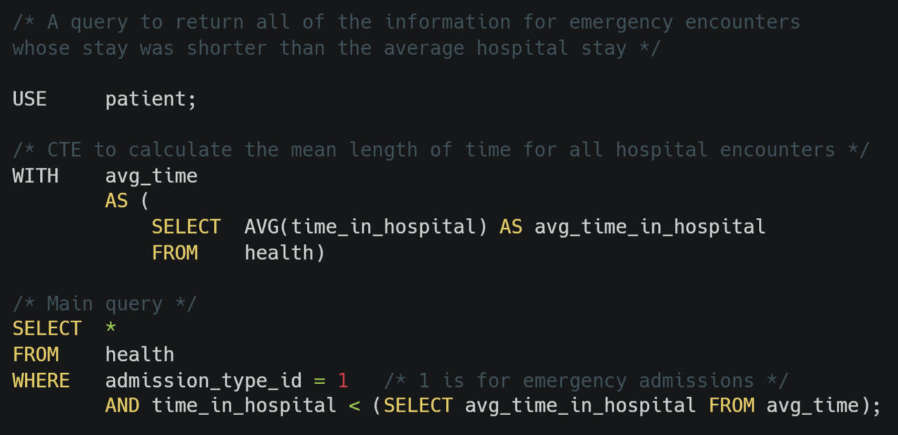
Problem #7
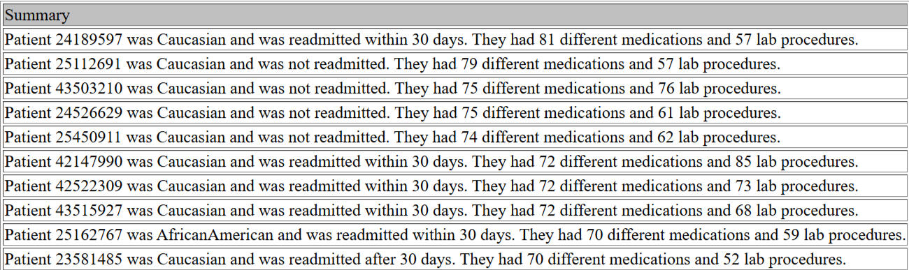
I want a short text summary for the top 50 encounter records by number of medications recorded.
- From Dr. Boreman Slack chat
Insights
The most medications in a patient encounter was 81.
80% of the top 50 encounters were given 64 to 69 medications.
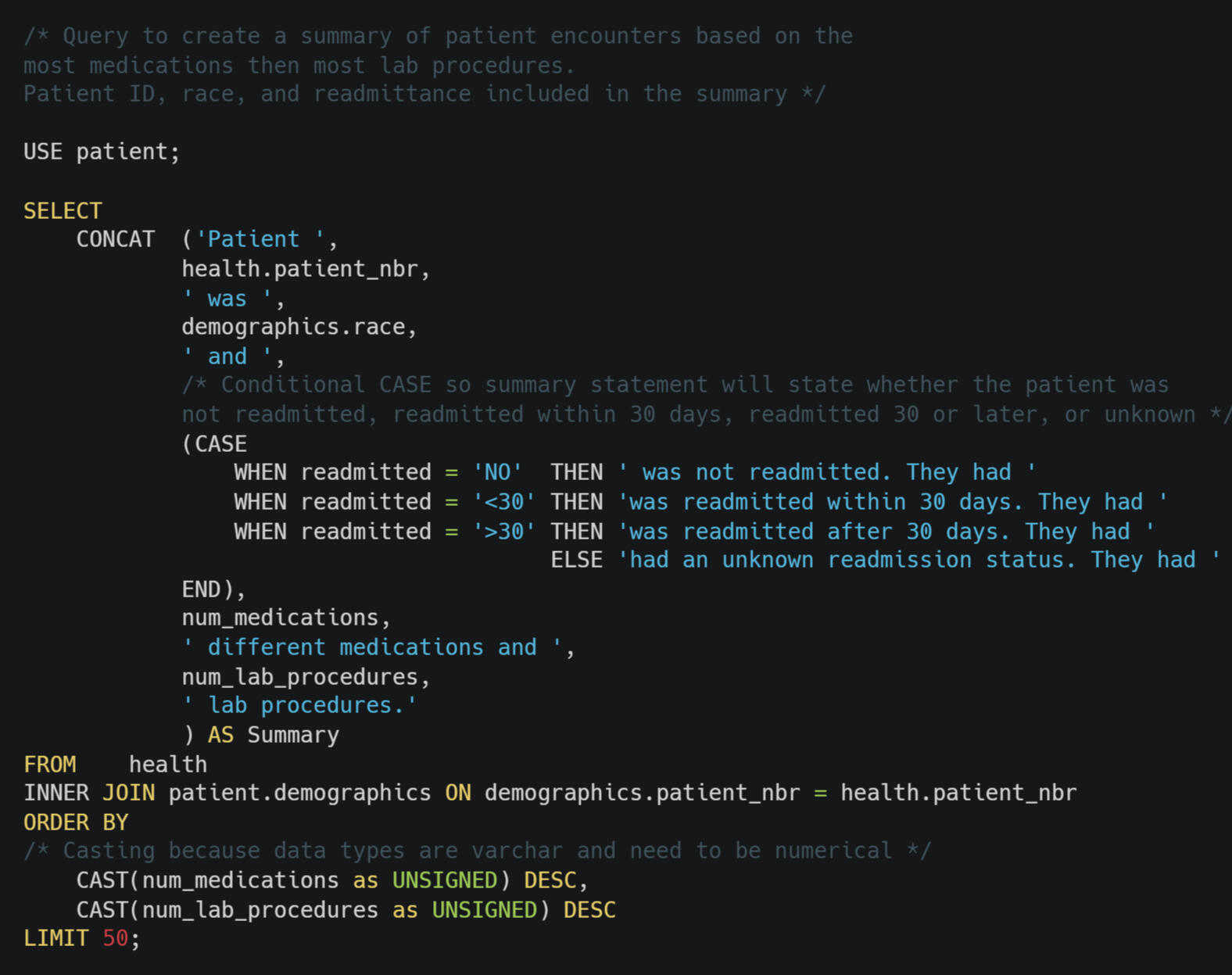
First, I asked Dr. Boreman what he wanted in the summary. They wanted the patient ID, race of the patient, the number of medications, the number of lap procedures, and if the patient was readmitted. I replied asking how to break any potential ties in case patients had the same number of medications. I thought, "Please don't write penalty kicks." Dr. Boreman wrote to use the number of lab procedures.Writing query to obtain and order this information was simple. The requested information was from two different tables. They both had a the column patient_nbr. This was the primary key in the demographics table and the foreign key in the health table. This made joining a snap.Since I was asked for a text summary, I chose to use CONCAT to write a sentence for each of the 50 encounters. CONCAT can combine text. In the image of the summary statements above, all of the numbers and the races come from dataset. Notice how there is no space between African and American. I would add a space if this were for a presentation. This time, Dr. Boreman just wants the information.I thought it strange that all of the top 50 encounters had 9 medications and they all had lab procedures beginning with a 9.Oops!The data types for the number of medications and lab procedures were both varchar. That is, they were text, not numbers. I needed the data as numbers. If I changed the data type, then it would change for everyone in our organization. I made a note to ask the database administer if the data type can be changed.In the meantime, I used CAST to change the data type just for my query. This way I can get the summaries to Dr. Boreman without making unauthorized changes to the database. I am using MySQL. Casting as UNSIGNED means the data type will temporarily be an unsigned BIGINT. That is a data type that can be zero through way more positive integers than I will need. I used unsigned because a negative number of medications and lab procedures does not make sense.I sent Dr. Boreman his summaries. Then I went to make the data type change request to the database administer.Note: The image of the table above is a partial list. I suspect nobody reading this projects wants to see 50 summary sentences. If you do, You can click to see the whole table..The image below show the SQL code I wrote for this problem. You can download my code hereFun Fact: Dr. Boreman was the my pediatrician and the earliest doctor I remember.
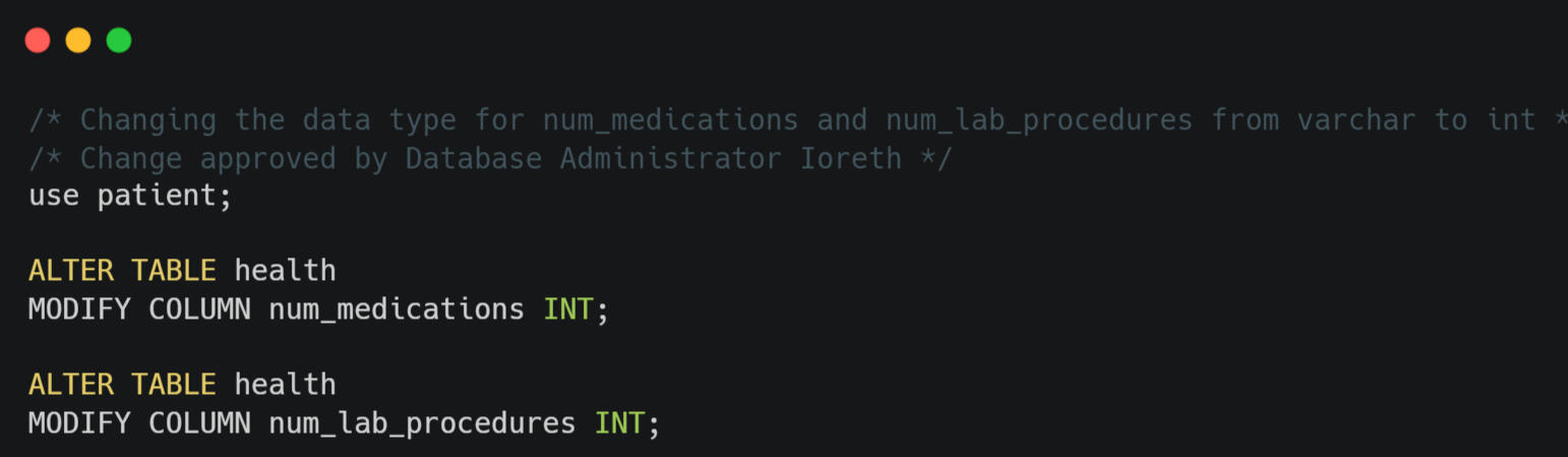
Problem #8Email from Database Administrator:Thanks for catching that the fields for nummedications and numlab_procedures were varchar. You have been granted write access.Please change these fields to INT ASAP.
Ioreth
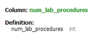
Administrator Ioreth,Thank you for giving me this responsibility.For this problem, the code is simple. The biggest issue is to be careful. Is there a data analytics equivalent to the saying, "Measure twice; cut once?" The changes I made for this problem affects all other users of the database.I used ALTER to change the data type of the two columns. The image above is a screen shot from the scheme seen in MySQL Workbench showing the data type was changed.The image below show the SQL code I wrote for this problem. You can download my code here.Fun Fact: Ioreth is a character from J. R. R. Tolkien's Return of the King. She worked in the Houses of Healing in Minas Tirith.
Problem #9Hospital manager Yuan walked over to my desk and ask:“How do these three medications rank by usage across each age group?”She handed me a slip of paper that had:
💊 insulin
💊 metformin
💊 glipizide
Insights
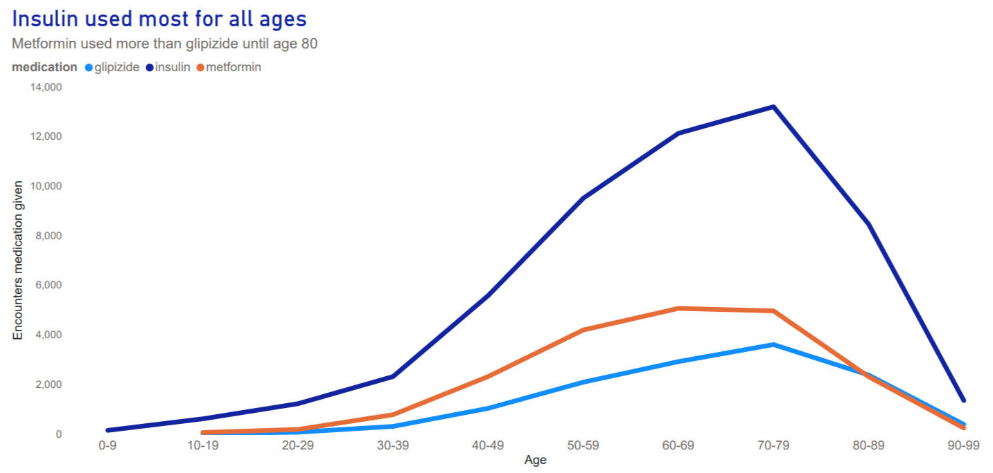
Of the three medications, insulin was used the most in all age groups.
Metformin was second most used medication for ages 10 - 79.
I asked Manager Yuan how did she want me to group the ages. She said to use ten year groups, like zero to ten.Thankfully, that is how the age data was recorded in this dataset. This was probably done to protect patients' privacy and HIPAA rights.A challenging part of this problem is that the three medicines and their usage were in 3 different columns. Each medication column had the possibilities of no, up, down, or steady. This made it hard to compare the three medications requested.I used a UNION to reshape the health table from wide to long. Instead of each medication having its own column, now medication is on rows in one column. See the images below.The first image shows the original wide table.
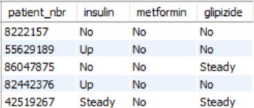
The next image shows a long table after the UNION.
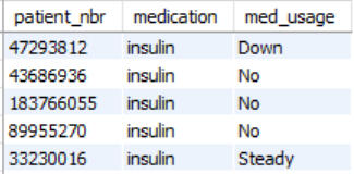
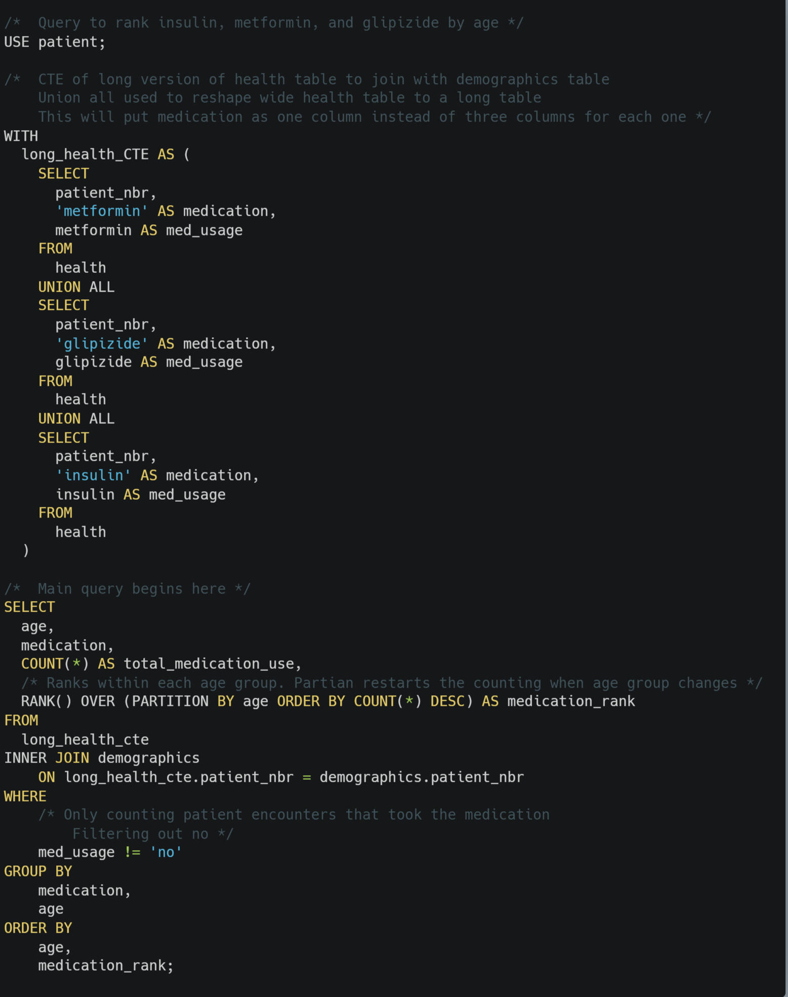
I used UNION ALL this time. I did not want to delete the duplicates. There may be duplicates because a patient may have multiple encounters and have the same medication usage data.Now I could do some comparisons. I also needed to add the age groups. Age was on the demographics table. That meant a JOIN. I turned the first long table into a CTE (Common Table Expression) so that I could join it to the demographics table. Now I can JOIN the table to add an age column to my query output and use ORDERED BY to sort by age.All of that and I still have done any counting to rank the usage. SQL nicely has a COUNT function to making counting easier. I needd to filter out when the medication wasn't used by the patient during their encounter. I did this with a WHERE statement.After counting, I used the window function RANK to see which medicine was used most in each age group. I used PARTICIAN BY to restart the count for each age group.I checked these results with a physicians assistant who told me these results make sense. Metformin is used less with elderly patients because of its effects on kidneys. Though Hospital Manager Yuan only wanted the ranks of the 3 medications, I ran a query with all to make sure that my key insight statements were accurate for all medications in the dataset.The image below show the SQL code I wrote for this problem. You can download my code here.. I created the line graph above in Power BI. You can download my Power BI file here. You can download a PDF of the graph here. You can also download a CSV of the SQL query output here.Fun Fact: Yuan is a character from Robert Jordan's Wheel of Time series. She is of the Yellow Ajah, the healers.
Conclusion
A lot can be learned from healthcare data. These conclusions are based on data from the treatment of patients with diabetes for 10 years in the United States.⚕️Insulin is used the for hospital patients with diabetes across all age groups.
⚕️Looking at the patient encounters with most medications, the majority were given 64 - 69.
⚕️The average hospital stay was shorter for emergencies than the overall average stay.
⚕️There was some evidence of a potential positive trend between the number of procedures and the how long a patient encounter lasted.
⚕️Each race had about the same number of lab procedures per encounter. I recommend checking other variables and a qualitative survey to check for any patterns of racial discrimination that may be occurring.
⚕️Thoracic surgery had the highest number of procedures per encounter. Radiology and cardiology had a similar number of average procedures at thoracic surgery. They had many more encounters leading to higher total procedures.
⚕️The most common length of stay in a hospital with 2 or 3 days.
Personal Reflections
Data that has not been recorded cannot be analyzed.After having a surgery, I was sent home the next afternoon. I was given prescription for pain medication plus lots of directions for rehab stretches. On the way home, I started to feel pain. It was not yet time for more medication.The pain increased exponentially. When it was time, the pain medication did not help. I was driving to emergency room in the worst pain of my life by far.When I saw the first problem for this project was asking if most patient encounters were less than 7 days, my heart started beating faster remembering when I was discharged early and the pain I experienced as a result.The only potential indicator of patient healing in this dataset is readmission. That is not a great measure as perhaps some people cannot afford to go back. Given my experience and that issues over the closest hospital for my family, I want to emphasize that the purpose of healthcare is the care for people and help them to be healthy. I wish this dataset had information of patient health improvements and satisfaction.As a teacher and a coach I often collected my own data. Sometimes I collected needed to add new fields so that I could analyze data to answer the questions I wanted to answer.I know many data analyst might not have any say in what data is available. I have showed that I can work this way by solving all of the problems that were given to me.I am also demonstrating that I have experience in deciding what data is needed to solve a problem.When you hire a former teacher, you get much more than an entry-level data analyst. You get someone with flexible and critical-thinking skills who has been in involved in the entire data life cycle from planning, to collecting, to entry, to organizing, to cleaning, to presenting, to decision-making, to reflection, to confidentiality, to documenting.I was a data-driven teacher.
I am a curiosity-based analyst.
Recommendations
🩺 I recommend a regression analysis to extended problem 4 to see if there is a correlation between procedure frequency and length of hospital stay. The potential trend seen in the table with grouped averages might not be statistically significant.
🩺 I recommend more study on racial discrimination. Analyses should be done with more than one variable.
🩺 I recommend a patient survey to check for patient perceptions of racial discrimination.
🩺 I recommend collecting data on health outcomes beside readmission. Many people might not seek readmittance for reasons other than their health improved.
Call to Action
Could your organization benefit from my curiosity-driven analyses? Do you like to interact with a lifelong learner who improves his skills with each project?Let’s connect.
Email [email protected]
Connect on LinkedIn
Glossary
Correlation: A number that can show if two things might be connected. It is important to remember that a strong correlation does not mean that one of the things caused the other.
Distribution: In statistics, a distribution shows how the data is spread out.
Encounter: When a patient is admitted to a hospital. If a patient is discharged and admitted later, this counts as a second encounter.
Readmission: The same patient checking into the hospital more than once. The dataset shows if a patient returned in less than 30 days, more than 30 days, or not at all.
Regression: A statistical analysis to see if two things might be related. This is to see if it appears one thing might impact another.
Sources
https://carbon.now.sh
Clifford, T. (2026, May 26). Patient on psychiatric hold dies by suicide in Mission Hospital emergency department. Asheville Watchdog. https://avlwatchdog.org/patient-on-psychiatric-hold-dies-by-suicide-in-mission-hospital-emergency-department/
Clore, J., Cios, K., DeShazo, J., & Strack, B. (2014). Diabetes 130-US Hospitals for Years 1999-2008 [Dataset]. UCI Machine Learning Repository. https://doi.org/10.24432/C5230J.
Strack, Beata, DeShazo, Jonathan P., Gennings, Chris, Olmo, Juan L., Ventura, Sebastian, Cios, Krzysztof J., Clore, John N., Impact of HbA1c Measurement on Hospital Readmission Rates: Analysis of 70,000 Clinical Database Patient Records, BioMed Research International, 2014, 781670, 11 pages, 2014. https://doi.org/10.1155/2014/781670
Wikipedia Commons [complete later]
https://en.wikipedia.org/wiki/Florence_Nightingale
🏡Residential Real Estate in the United Kingdom

Latha math! Good day!My grandmother was born in Alexandria, Scotland. This is close to the bonny, bonny banks of Loch Lomond. The photo above shows some property for sale in Alexandria.
Why I Chose This Project
I chose this project as a part of my internship with Snow Data Science. I wanted to do this project because many people would like more information when buying or selling a home. Completing this project help me to grow my skills to give insights to help people.I also chose this project because the data set was messy that required some difficult decisions. I wanted to grow my analyst skills by taking on this challenge.Finally, I chose this project because it came with a team. I worked with four others remotely to answer nine challenging and interesting questions.Unfortunately, there was nothing in the dataset about property in the UK where my family have lived.
What You'll Learn
You will learn about residential real estate trends in the United Kingdom.
⚫You will see how the turnover rate for property changes based on the postcode areas and type of home.
⚫You will see how the price of a home increased in Guildford as you move up the property ladder.
⚫You will see how the price changes based on the postcode area and the tenure of the property.
Key Takeaways
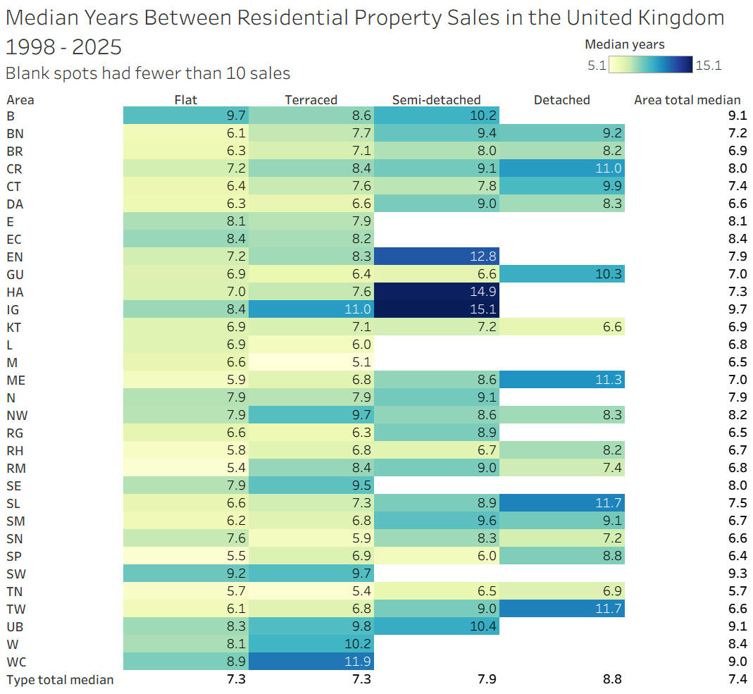
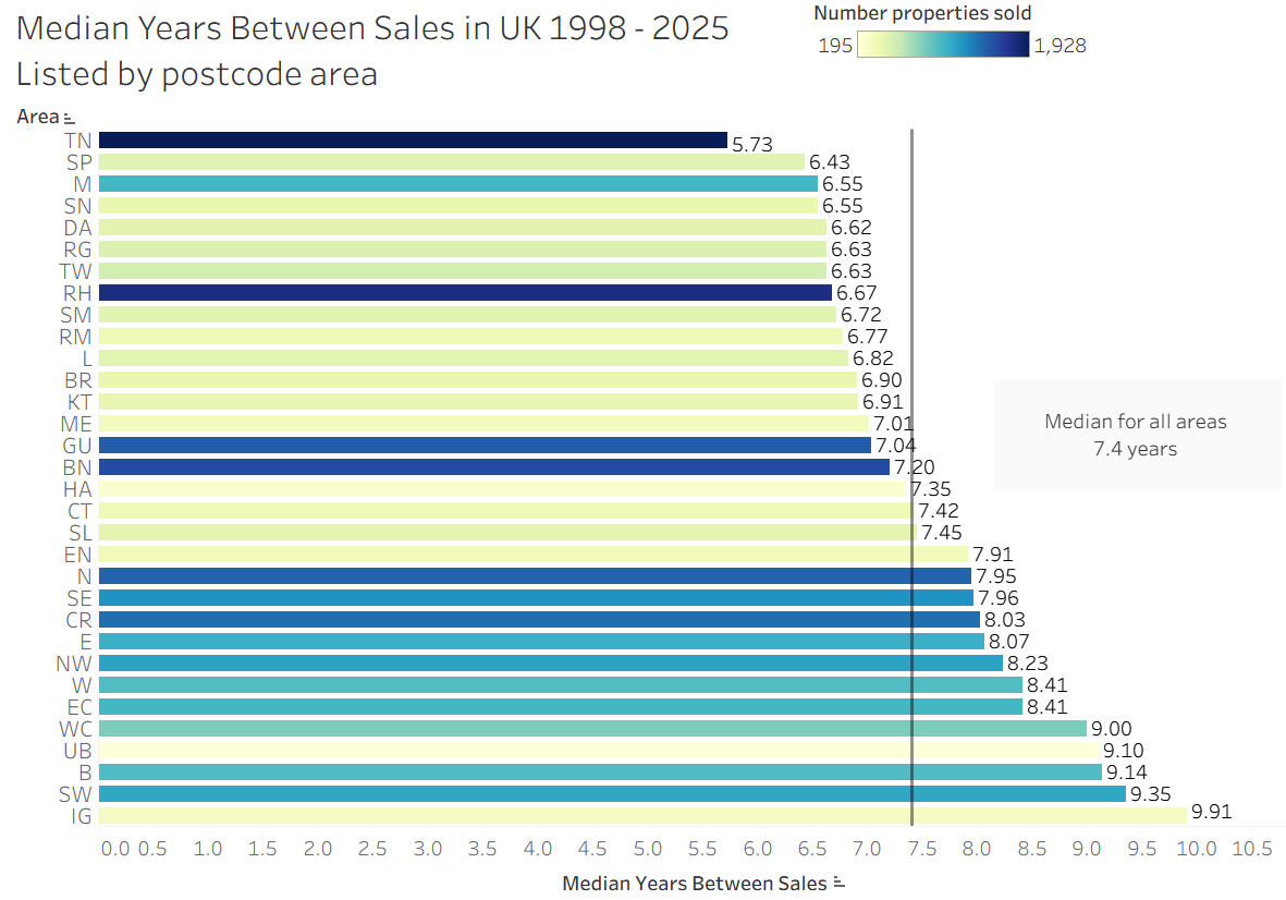
⚫ The median turnover time is 7.4 years. The range of median years has a low of 5.7 years in Turnbridge Wells and a high of 9.9 in Ilford.
⚫ Flats and terraced had about the same turnover rate. Higher rungs on the property ladder had about 10% longer turnover than the previous rung.
⚫ Freehold property costs more than leasehold, with the difference in median ranging from 17% more to 220% more, depending on the area.
Dataset Details
The data set was published on Kaggle and originally came from Right Move and HM Land Registry. The data set has two tables linked with a primary key.Both tables contained real data residential real estate deals in the United Kingdom from 1998 - 2025.Some of the data was missing. Some of the data was not formatted for analysis. Some of the data presented challenging decisions that I had to make.
Audience
With any data analysis project, it is important to know who the audience of the final report will be. My supervisor wrote:"Everyday home buyers and sellers in the UK, plus curious listeners who want a clear story about what is happening in prices.So not real estate agents, not government, not commercial investors as the main focus."Since this is a part of my portfolio, there will also be explanations for potential employers or anyone who would like to know more about some of my analytical thought processes. Please message email [email protected] or message on LinkedIn if you would like to know more about my analytical thought processes.
Messy Data Decisions
Same day sales
The dataset included properties that were sold on the same day. One property in Aberdeen was sold five (5) times in one day. I did some research and confirmed these were real sales and not a data error.Everyday home buyers and sellers are not typically buying and selling the same house one the same day. Since this is my audience, I did not consider any properties sold in less than ten (10) days.In Tableau Public, the minimum number of days between sales can be adjusted to meet the needs of anyone using this analysis.Sales Price Outliers
I used medians instead of mean when analyzing sales prices because there were some outliers. This was I could keep those sales in the data without the outlier prices making a large impact on the averages.Aberdeenshire
Property sales in Aberdeenshire were the weirdest. About 1,000 sales did not have a tenure listed. Overall sale prices were significantly lower than all other areas. Plus the property sold five times in one day mentioned above had a sale price of £1,000.The dataset was missing a lot of data from Scotland. It did not have any sales in Glasgow. For these reason, I did not include any transactions in Aberdeenshire in my analysis.
If you have any questions or would like more details about my data decisions, cleaning, or thought-process, please contact me on LinkedIn
Analysis
Prompt #1
Typical time between sales
⚫ Show the median time to the next recorded sale, in years.
⚫ Break it down by property type and postcode area.
Insights
7.4 years. This is the overall median years between sales, AKA turnover rate.
In general, the further up the property ladder, the longer the turnover rate.
The three longest turnover rates were in semi-detached housing in area with fewer than ten (10) sales of detached housing.
Insights
The range of median years between sales by area is 5.7 to 9.9 broken down by area alone.
Turnover appears fastest in Tunbridge Wells [TN], Manchester [M], and Salisbury [SP]
Turnover appears slowest in Ilford [IG], South West London [SW], Birmingham [B}, and Southall [UB].
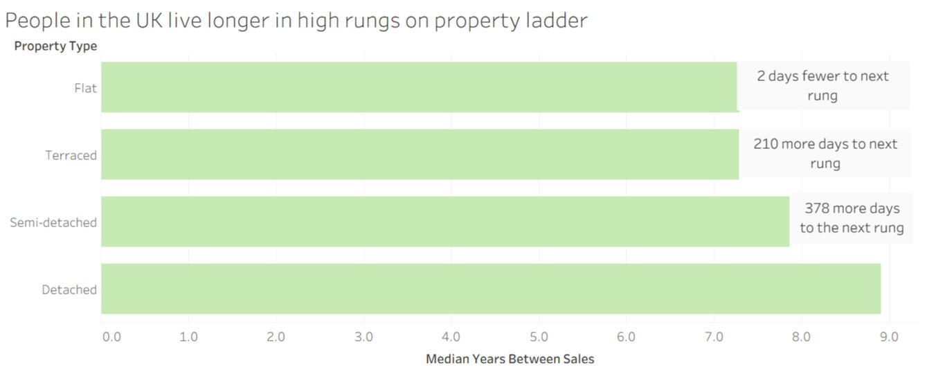
The range of median years between sales by area is to 7.3 to 8.9 years broken down by area alone.
Turnover rate usually increases for each rung higher on the property ladder.
The two biggest challenges with this prompt to show typical times between sales was to calculate the time between sales and to isolate the post code area.I first used Snowflake SQL to join the two tables that were a part of the data set. I selected just the columns that I needed for this prompt. I also sorted by the property ID and date of sale. This was to help calculate the time between sales. I exported this query as a CSV.In Excel, I used a formula to calculate the time between sales in a new column. The formula checked the row above to see if it was the same property. If so, then it subtracted the two sale dates.The postcode area is a part of the postcode, which is a part of an address in the UK. I solved this problem in Excel. First, I used a formula to isolate the postcode fro the rest of the address in a new column. Next, I used a second formula to isolate just the postcode area from the postcode in a new column. This was the trickiest as some area have one letter and some have two.Example 1
Address: 16, Waddon Close, Croydon, Greater London CR0 4JT
Postcode: CR0 4JT
Area: CRExample 2
Address: 15, Apartment 23, Wolstenholme Square, Liverpool, Merseyside L1 4JL
Postcode: L1 4JL
Area: LI exported this CSV with the new columns to Tableau. I also used a pivot table in Excel to explore the data and to confirm what I found using Tableau.My Mistake
When I read the prompt stating, " Break it down by property type and postcode area,' I read it as two different breakdowns. I was wrong. I was being asked to break down the medians using two different variables at the same time. I wished I had asked for clarification earlier.I am glad that I showed my supervisor for this task my work at the midway point. He was able to point out my misunderstanding. I had lots of time to create the desired visualization. I have kept the two graphs that I created to break down the turnover time broken down by postcode area and property type separately.
If you have any questions or would like more details about my analysis, thought-process, code, or formulas, please contact me on LinkedIn
Prompt #2
Price ladder by property type in one area
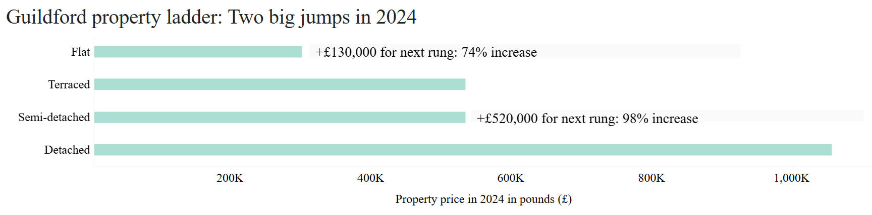
⚫ Pick one postcode area and one year.
⚫ Show median sale price for Flat, Terraced, Semi detached, Detached.
Insights
In general, homes higher on the property ladder cost more in Guildford
Flat to terraced was 130,000 pounds more, a 74% increase
Terraced to semi-detached cost about the same
Semi-detached to detached cost 520,000 more, a 98% increase
The first thing I did to answer this prompt was to research what a property ladder is. A property ladder has different types on each rung, with the higher rungs typically being more desirable and most expensive. The bottom rung is thought of as a starter home. In the United Kingdom, the four rungs are from bottom to top are flat, terraced, semi-detached, and detached. For more details, please see the glossary.The biggest challenge with this prompt was picking an area. The first four postcode area I picked did not have a large enough number of sales for each rung on the property ladder in one year. The data set was missing several postcode areas in Scotland, including Glasgow, there area my grandmother was born in.I picked Guildford because it had more than ten sales for each rung in 2024. 2024 was the most recent complete year in the data set. The town of Guildford has some interesting history. It was first mentioned in the writings that have been found in 880 CE. During World War II, 2500 children from London were taken to Guildford. Guildford has some of the most expensive properties in England outside of London. Plus there is a town in the Guildford area named Bagshot. In The Lord of the Rings, Samwise Gamgee and the the Gaffer lived at Number 3 Bagshot Row.The analysis part of this prompt was much simpler because of the work I had already done with prompt 1. I only needed to filter for the Guildford postcode area, GU, and for properties sold in 2024.The sizing of the vizualation was a challenge. I made the graph in Tableau. When the sizing was good in Tableau, the words were too small on this website. Optimizing for Carrd meant the sizing was not good in Tableau. The medium of data communication is important. An analyst may need multiple versions depending on how and where they are communicating.
If you have any questions or would like more details about my analysis, thought-process, code, or formulas, please contact me on LinkedIn
Prompt #3
For each postcode area, compare median sale price across Leasehold and Freehold tenure.
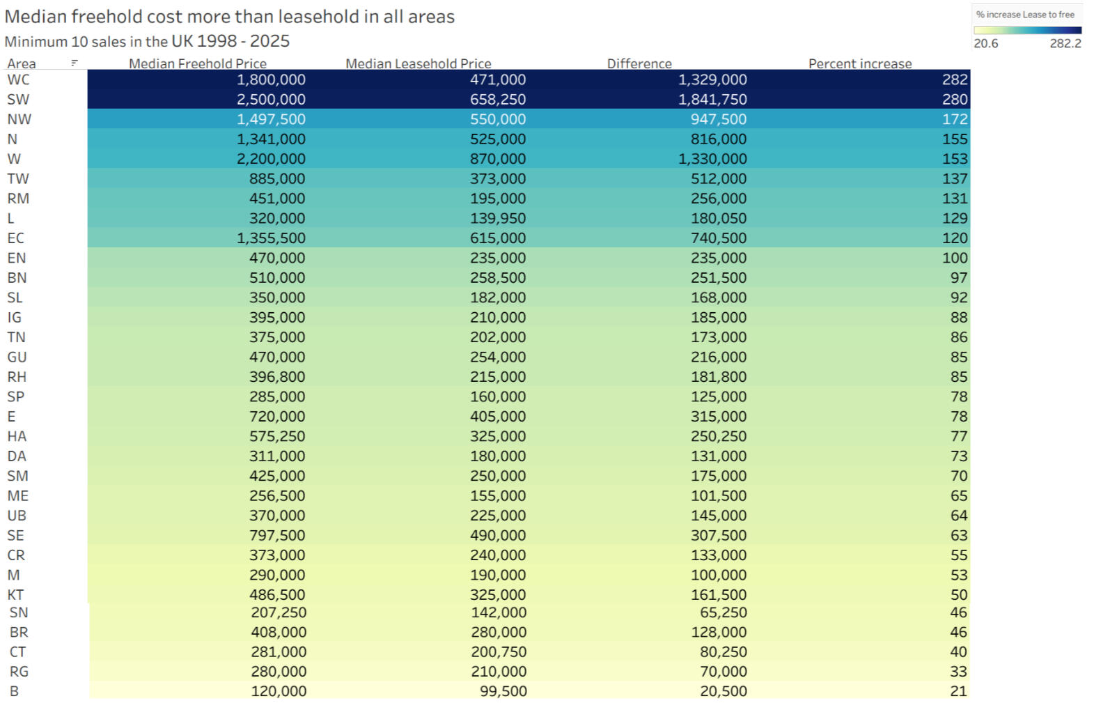
Purchasing with a freehold tenure costs more on average than leasehold in every postcode area
Positive correlation between the median leasehold price in an area and percent increase to median freehold price
This prompt was my favorite because I got to do some research and learn how to do new things in Tableau.The sales prices had a pound symbol in the data. I used Excel to remove it so that I could make calculations with numbers.To answer the prompt, I created a two-way table in Tableau that had showed the median price for each tenure type in each postcode area. I noticed that the median freehold price was greater than the median leasehold price in all areas. This made sense because owners have more freedom with a property that is a freehold.I was curious how much more did a freehold cost in each area.I did not know how to get Tableau to subtract the median leasehold price from the median freehold price in each area. I could not create a calculated field that said free minus lease because the tenure type data was all in the same field.I did some research and was able to solve this problem by using relative columns. I could create a field that would subtract a column by one to its left. I was not satisfied with this approach as the results would change if the columns were moved.I asked several people who have used Tableau more than me for their advice. One was able to show me how to use helper created fields to separate the prices for freehold and leasehold even though they were in the same field.Next, I took the logic of my advisor and created another column to calculate the percent increase from leasehold to freehold.When I sorted the table by the percent increase, I noticed that the largest percent increases were in the areas that had some of the larger median prices in general. Sometimes looking at data can lead to false conclusions. I calculated a linear regression with the median leasehold price for each area and the percent increase to the median freehold price. There was a strong positive correlation. The correlation coefficient (r) was about 0.6.
If you have any questions or would like more details about my analysis, thought-process, code, or formulas, please contact me on LinkedIn
Conclusion and Personal Reflections
I enjoyed this project. I liked how it was tool agnostic. I was able to use a combination of SQL, Excel, and Tableau. I was not given any directions are how to answer the prompts. The approaches I took did not have to be the same as anyone else.I also liked how I had to make decisions about some of the messy data. These were decisions that did not have a simple right or wrong answer.
Recommendation
Location. Location. Location.That is a real estate expression of wisdom, at least in the USA. This project shows that there are more variables to real estate pricing and turnover than location.I recommend that everyday home buyers and sellers find someone who can collect and analyze data with them. Real estate can be complicated. Having information about trends and averages can help to make sure they are getting a deal.
Call to Action
If you're interested in data-driven insights or need a data analyst, I'd love to connect and explore how I can help your business grow. Feel free to reach out!One of my strengths is curiosity and researching skills.I did not know much about real estate in the United Kingdom before this project. I had not done some of the data cleaning that was needed before.Could your organization benefit from my curiosity-driven analyses? Do you like to interact with a lifelong learner who improves his skills with each project?Let’s connect.
Email [email protected]
Connect on LinkedIn
Glossary
Area: A postcode area is the largest geographic area used for mail delivery in the United Kingdom. The area is seen in the first one or two letters in the postcode.
For example, Sherwood Forest has a postcode of NG21 9RN. The area is NG, Nottingham.Detached: A detached house does not share any walls with another building.
Flat: A flat is housing on floor in a building that has similar housing.
Freehold: A person owns the land and the residence.
Leasehold: Someone owns the residence, but not the land. They lease the land for a set period.
Property ladder: A theoretical system where a person buys a property type on the lowest rung first and then move up the ladder for future purchases.
In the United Kingdom, the lowest rung is flat. The second rung is terraced. Third is semi-detached. The final rung is detached.Semi-detached: A type of housing that shares a wall with another house. The shared wall is known as the party wall.
Terraced: A terraced house is a part of a row of connected housing. Most terraced homes will share two walls with other homes.
Tenure, Property: Tenure describes who the legal ownership arrangement for a property. The two main types in the United Kingsom are freehold and leasehold.
Turnover: Turnover in real estate describes a property changing owners. I used years to measure turnover.
Sources
Address and postcode of publicly listed or widely known places in England , UK. (2025, June, 9). United Kingdom News and Update. from https://ukpostcode.org/content/address-and-postcode-of-publicly-listed-or-widely-known-places-in-england-uk/
Different Types Of UK Property Explained. (n.d.). Petty Son & Prestwich. Retrieved April 6, 2026 from, https://www.pettyson.co.uk/about-us/our-blog/578-types-of-property
How to get on and climb the property ladder. (2021, November 26). Martin & Co. https://www.martinco.com/guides/buying/move-up-property-ladder/
Property Tenure: Everything You Need to Know About Property Tenure and How It Impacts Property Ownership. (2026). Finbri. Retreived May 29, 2026 from, https://www.finbri.co.uk/glossary/real-estate/property-tenure/
Wilson Street, Alexandria. (2026, February, 26). Right Move. Retrieved March, 9, 2026 from, https://www.rightmove.co.uk/properties/172600340#/?channel=RES_BUY
💲 Financial Support for Zimbabwe

Once upon a time, I worked in the grounds and maintenance department for a small graduate school. Most of my coworkers were international students. We became friends, sharing meals after hours.One task that two people had to do each day was to clean bathrooms and pick up trash from offices. I was cleaning a restroom with a colleague I knew was from Zimbabwe. I asked him what town he was from. He said his last name. Whoa. He lived in a village that was named for his family.After I was married, I discovered they had welcomed a student from Zimbabwe as a close family friend.
Why I Chose This Project
I chose this project for my first SQL project for a few reasons. One is because the data set has over one million rows. It has too many rows from Excel. This is the type of data set where I have to use SQL. A second reason is that world economics has been in the news often in the past year. With the United States cutting aid to other countries and increasing tariffs, loans and grants from other institutions, such as the International Development Association (IDA), might be even more important in the near future.I chose to focus on Zimbabwe because of the kind and wise people I have met who live there.
What You'll Learn
You will learn that Zimbabwe could use some help. According to The Atlas for Economic Complexity, Zimbabwe ranks in the bottom 25% for GDP and economic complexity. Yet, it has not been in the top 25% for projects supported by loans or grants from the IDA. Zimbabwe has currently paid back a little more than half of its loans from the IDA.
Key Takeaways
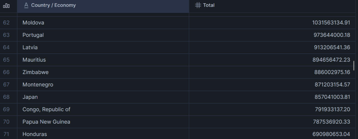
⚫ Zimbabwe ranks 66th out of 144 countries for money loaned or granted by the International Development Association (IDA).
⚫ Zimbabwe ranks 78th out of 147 countries for the number of projects that have received money from the IDA.
⚫ Zimbabwe has repaid 54% of their loans to the IDA.
Dataset Details
The data set comes from the World Bank Bank group. The version I used was up to date as of December 31, 2025. The data has information about loans and grants from the International Development Association (IDA) to countries and other economies around the world. Since 2011, each project has been updated monthly. Old data is kept in the data set after a new update.The data set has over one million (1,000,000) rows. It has 33 columns.
Analysis: Process and Results
Tools
For this project, I mostly used Snowflake SQL. The data set had too many rows to analyze with Excel. I chose Snowflake because I had experience with it.
Data cleaning 1
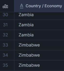
Since I was answering questions about Zimbabwe, I wanted to make sure that any queries would get all of the data for Zimbabwe. I checked the listed names of all countries that started with Z. I used the SUBSTR function to look at the first letter only in each country name. I used the LOWER function in case there were formatting differences.The data set did not need cleaning. All of the Zimbabwe listings were spelled correctly and all were capitalized.

Data cleaning 2
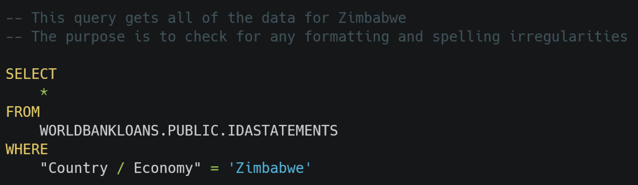
Next, I wanted to check the formatting of all of the Zimbabwe rows. By ensuring that I could get all of the Zimbabwe data with a simple WHERE command, I would not need to check nearly as many rows.Two columns had inconsistent formatting involving capitalization, “BORROWER” and “PROJECT_NAME.” However, each borrower and each project name was consistent. For example, the borrower “H. M. TREASURY” had all capital letters each time it was used and “Zimbabwe Electricity Supply Commission” had each word capitalized each time it was used. I decided to use the INITCAP function in future queries involving the project name or Borrower to improve consistency.

Question 1. How much money has the IDA loaned or granted to Zimbabwe?
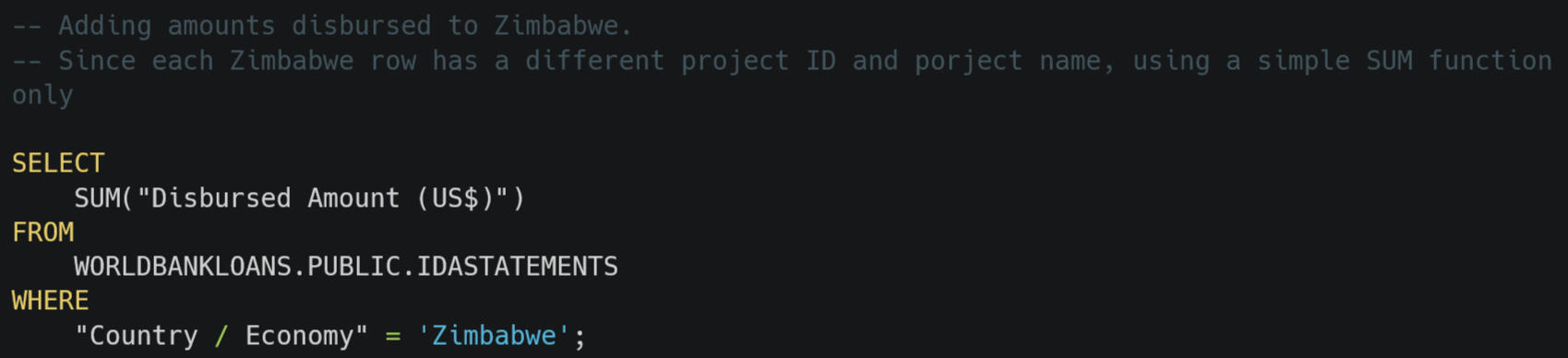
$886,002,975.16 (US$)I used the data dictionary to make sure that the column “Disbursed Amount (US$)” contained the exact amount that had been disbursed for each project. From an earlier query, I knew that each project ID and project name in Zimbabwe was listed once. So, I could get SQL to simply add all of the numbers in the “Disbursed Amount (US$)” column.

Question 2. How many projects has Zimbabwe received from the IDA?
22 projectsSimilar to the previous question, this one is simpler because each row of data involving Zimbabwe has a distinct project. I used the COUNT function to find the total number of projects. I checked loan_number, project_id, and project_name to confirm.
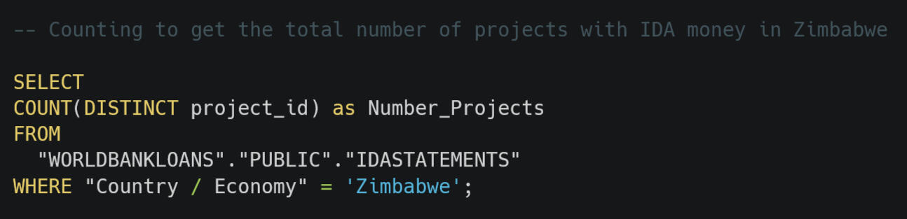

Question 3. Where does Zimbabwe rank globally in terms of number of projects with loans or grants from the IDA?
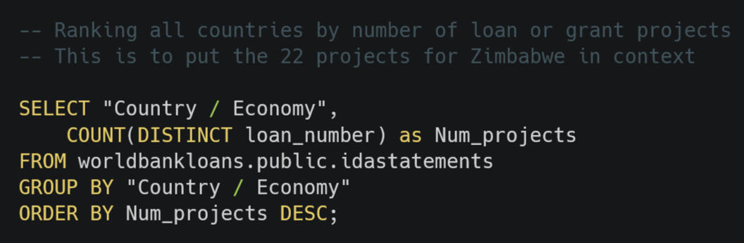
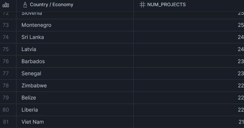
66th of 147In the previous question, I used SQL to determine that the IDA has given a loan or grant to Zimbabwe for 22 projects. This number needed context. I wrote an SQL query to see how 22 projects compared to the rest of the world.I used DISTINCT when counting the loan numbers because the data after 2011 is a monthly snapshot. Many other countries have the same project listed multiple times. I grouped by country. Then I sorted by the number of projects from most to least. This sorting made it simple to find Zimbabwe and their 22 projects.
Question 4. How much of the money the IDA has extended to Zimbabwe has been paid back?
⚫ $462,773,923.11 (USD)
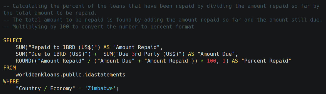
⚫ 54% repaidThis question is similar to question 1. I had already checked and seen that each Zimbabwe row was a different project. I only needed to add the amounts in the “Repaid to IBRD (US$)” column.
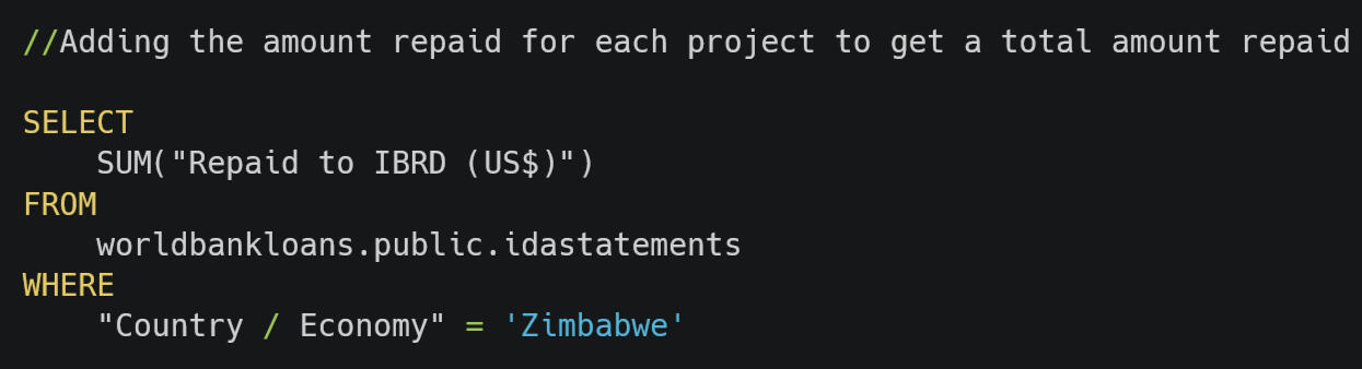

This number alone lacks context. I decided to find the percent repaid. I calculated the total amount that needs to be repaid using the “Due to IBRD (US$)” column. I used the sums from "Due to IBRD (US$)” and “Repaid to IBRD (US$)” to calculate the percent that has been repaid so far.I wasn’t sure that SQL could do calculations like this or what the syntax of a calculation was. I thought I would try it and see what happens. My instinct was correct. Score one for my combination of experiences in studying several coding languages, Excel formulas, and teaching math.

Question 5. What are the names of the top 5 projects the IDA has extended money into Zimbabwe?
⚫ Sap
⚫ Power I
⚫ Power III
⚫ Urban II
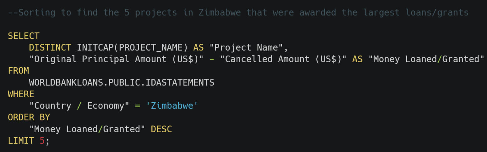
⚫ Manu.Sect.Export ProI used the DISTINCT function, though it was not needed in this case. I realize that many analyst’s tasks I will encounter will have much more than 22 rows that Zimbabwe has in this data set. I used the ORDER BY function and DESC to sort the projects from most money to least. I used the LIMIT function to make sure I only reported the top five (5).

Question 6. Which project in Zimbabwe had the greatest amount of money cancelled and how much was cancelled?
⚫ Railway Development
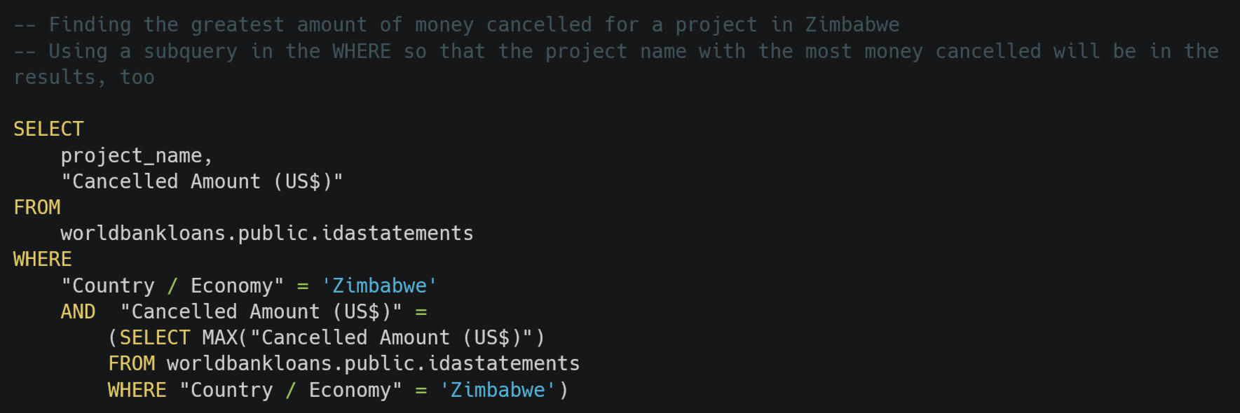
⚫ $17,439,748.42I could have written one query to find the greatest amount cancelled using MAX. I could have taken that amount and used it as a part of the WHERE clause in a second function to find the project name. Since two purposes of doing projects are practicing my skills and showing what I can do, I wanted to get the results with one query.I remembered something about subqueries from tutorials I completed back in five months ago. I did not remember exactly how to do it. First, I wrote down what I wanted the SQL code to do. I wanted the output to be the project name and the amount cancelled only for the project that had the most cancelled. This helped me to realize that the subquery needed to be in the WHERE clause. It took me a few tries to get the syntax right.

Question 7. What is Zimbabwe’s ranking among other countries/economies for most money loaned or granted?
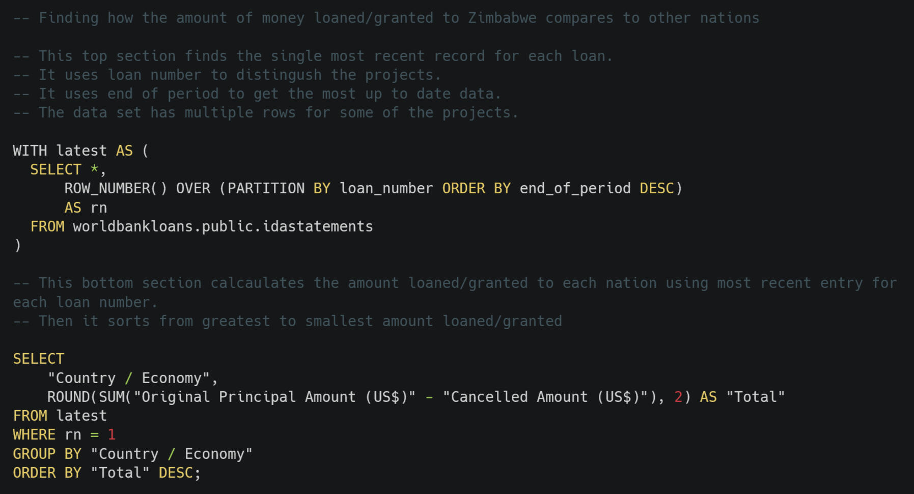
66th of 147The data set was designed so that each row was a snapshot in time. This means that the same project can have more than one row. It turned out that none of the Zimbabwe data had multiple rows for the same project. This is not true for all of the other countries.I was given a block of code that selects only the most recent row for each country/economy. I used that WITH function to help answer this question. After working through other questions in the project, especially question five [5], I understand this block of code much more. I did have to make some changes. The IDA Statement Of Credits, Grants and Guarantees - Historical Data table has changed column names since that code was created.Once I got a temporary table with just the most recent information for each project, I used that in my FROM to make the calculations to answer this question. I knew I wanted a column with the country/economy’s name so that I could easily find Zimbabwe. I also needed the total amount loaned/granted, which I had calculated in a previous question. I used the same formula of “Original Principal Amount (US$)” minus “Cancelled Amount (US$).” I grouped by "Country / Economy" so I could get a total for each nation. I also rounded to two decimal places, standard for US dollars. Then, I sorted so that the highest total loaned/granted was on top.
Question 8. How many projects in Zimbabwe involved transportation?
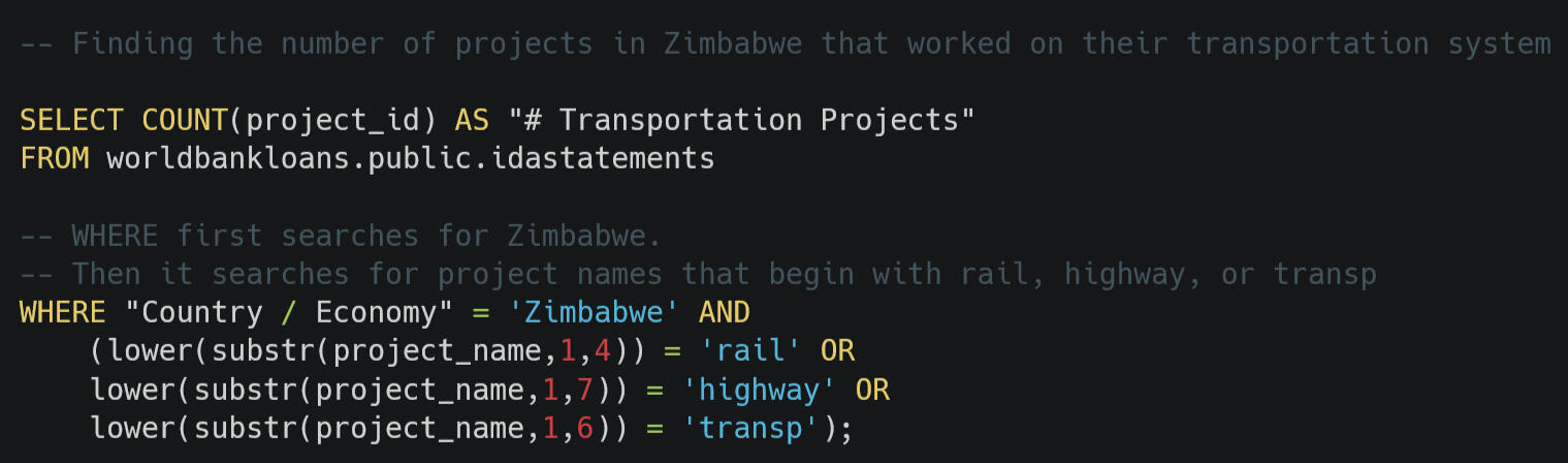
6 projectsThis question is made easier with Zimbabwe not having many rows in this data set. I took a CSV from earlier that included all of the project names in Zimbabwe. I scanned these for ones involving transportation.Some of the projects had titles that started the same, such as “RAILWAY” and “RAILWAY DEVELOP.” I used the SUBST function in the WHERE clause so that I did not have to enter as much code. I used LOWER because there are different capitalizations in the “PROJECT_NAME” column.

Conclusion and Personal Reflections
Using SQL to analyze this data set increased my confidence that I am a data analyst. This was my first data set with over 1,000,000 rows. The way I approached question 6 was especially helpful to me. By first writing down the output I desired and then determining the code structure, I showed myself that I can take what I have learned throughout my life and apply to new tools. In college, I took classes on multiple programming languages, including C++, Visual BASIC, and COBOL.I can do much more than follow along with tutorials.The results of this project have me wondering why Zimbabwe has received so little from the IDA when other economic stats show that it is not a wealthy nation and could use more support. There are no entries in this data set for Zimbabwe in the past decade.
Recommendation
People who care about Zimbabwe should look into reasons why there has been no activity between Zimbabwe and the IDA for over ten years. The United States has disbursed about 40% less aid in Zimbabwe in fiscal year 2025 than 2024. This is the lowest since 2015 and is not adjusted for inflation. In 2023, the United States was the largest governmental supporter of Zimbabwe (U.S. Agency for International Development and U.S. Department of State, 2025).Folks who care about Zimbabwe, both in and out of the nation, need to get advice from experts in economics and diplomacy to brainstorm how to make up this $150,000,000 difference plus find more to encourage a stronger and more complex economy for the good of the Zimbabwe people.
Call to Action
If you're interested in data-driven insights or need a data analyst, I'd love to connect and explore how I can help your business grow. Feel free to reach out!One of my strengths is that I have been working with computers since the 1980s, often without a lot of resources. I have spent a large portion of my life figuring things out by thinking about output and input, backing up, trying something, and making adjustments using error messages.Could your organization benefit from my curiosity-driven analyses? Do you like to interact with a lifelong learner who first learned to code reading the manual to a BASIC ROM cartridge?Let’s connect.
Sources
Growth Lab. (2025). Zimbabwe. The Atlas of Economic Complexity. https://atlas.hks.harvard.edu/countries/716/None
IDA Statement Of Credits, Grants and Guarantees - Historical Data. (2025, December 31). World Bank Group. Retrieved January 6, 2026 from https://financesone.worldbank.org/ida-statement-of-credits-grants-and-guarantees-historical-data/DS00976
U.S. Foreign Assistance By Country: Zimbabwe. (2025, November 12). Foreign Assistance. Retrieved January 22, 2025, from https://foreignassistance.gov/cd/zimbabwe/2024/disbursements/0
Washinyira, T. (2018, October 12). Zimbabwean waiter uses his wages to run a free soccer academy. Ground Up. https://groundup.org.za/article/zimbabwean-waiter-uses-wages-run-free-soccer-academy/
Zimbabwe. (2026. January 23). Wikipedia. Retrieved January 24, 2026, from https://en.wikipedia.org/wiki/Zimbabwe